Data Analysis of Released Spotify Tracks

Analysis
PowerPoint
Presentation
Design
Code
Authors
Published

December 3, 2025

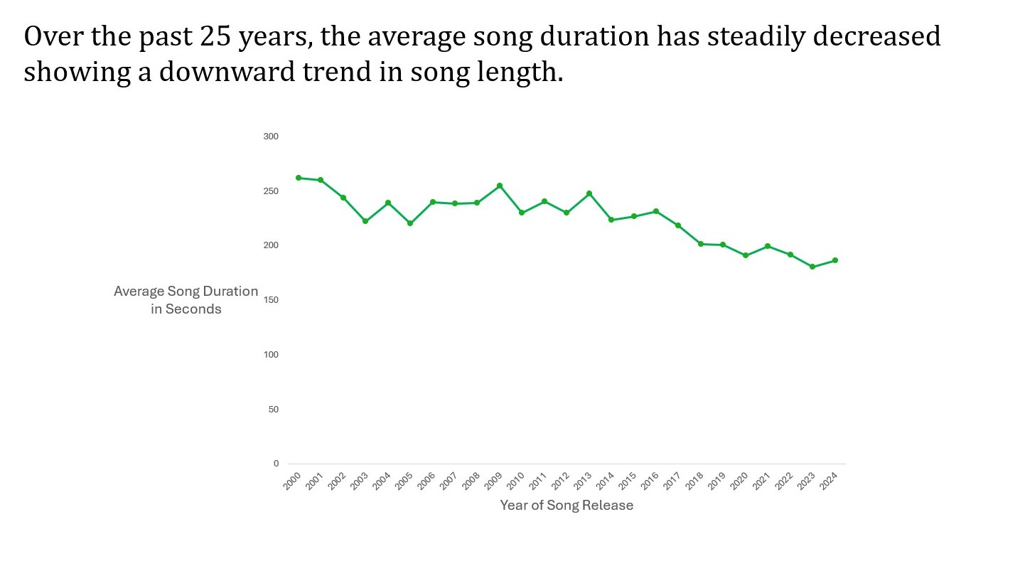
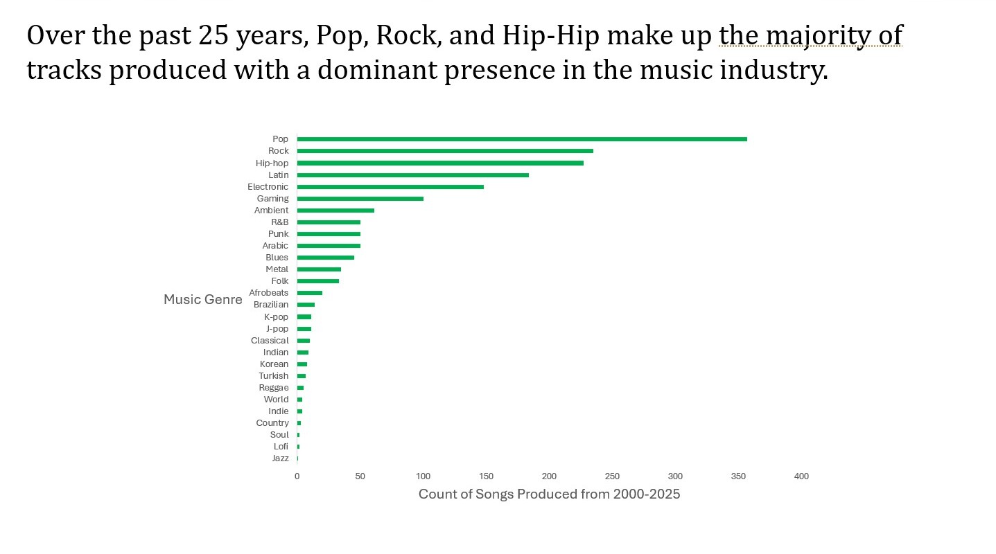
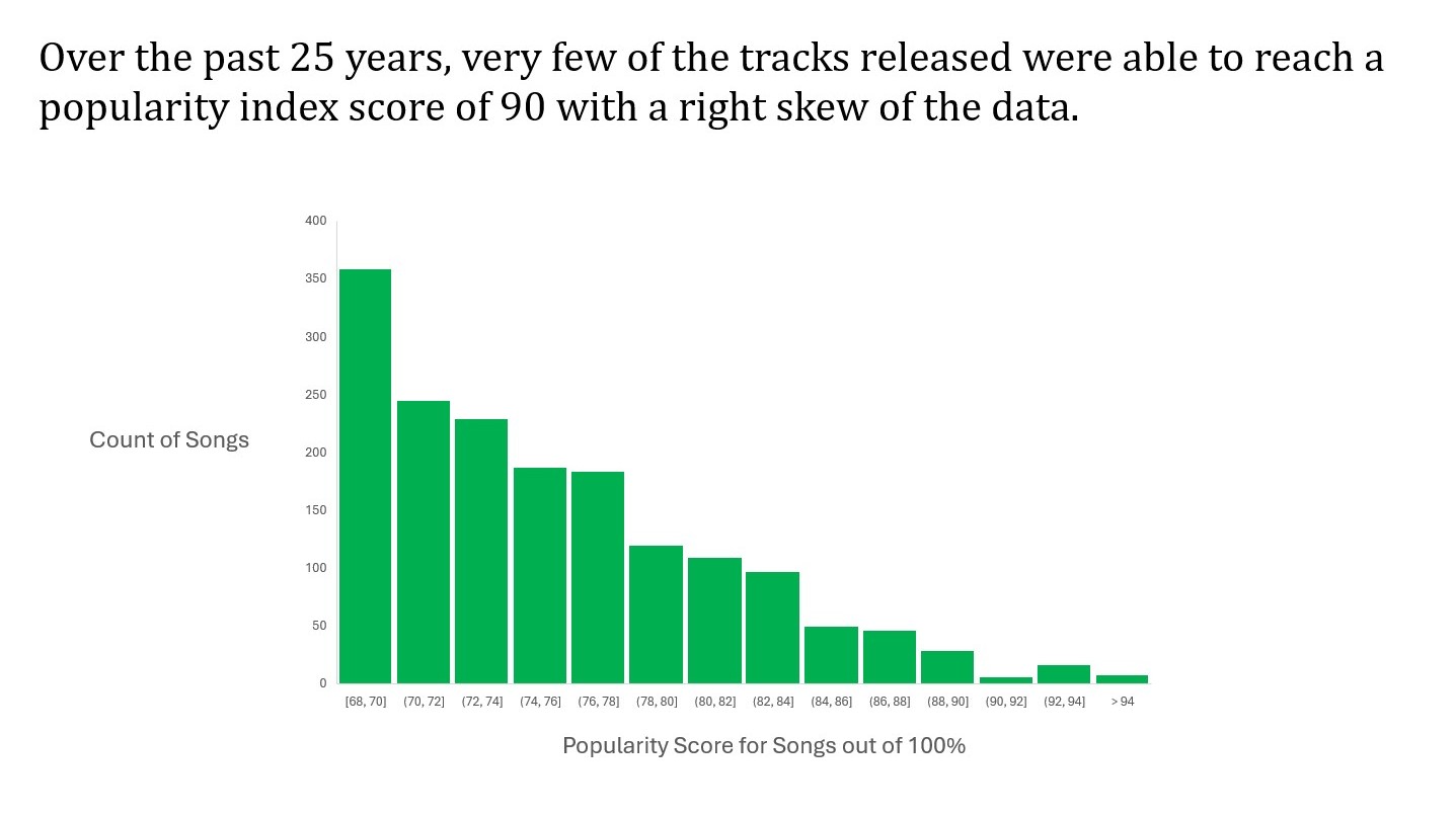
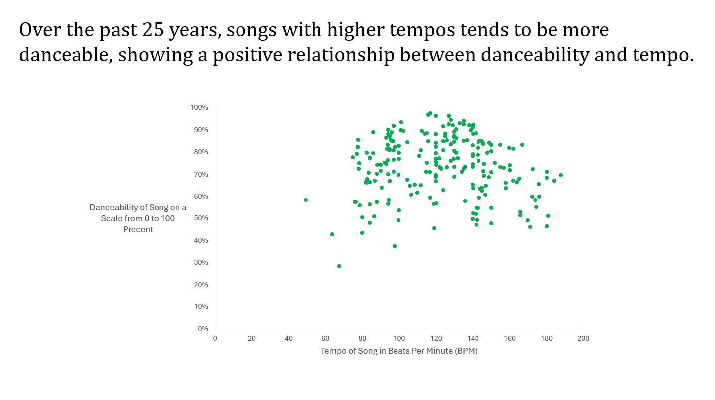
For this data visualization project we used a data set about released spotify tracks. This data set contains metrics such as Tempo, Length, Popularity, Release Date, and Danceability. Using this data set we were able to answer many questions a presentation of which is explained below.

How has the average song length changed over the last 25 years? This is an interesting question because it shows how song production has changed due to what is popular at the time. If shorter songs performed better than longer ones than over time we will see song length decrease. To answer this question we used pivot tables in excel. Using the average song length of a given year, and graphing it against the corresponding year on a time-series plot we can answer the above question. By developing this chart (shown above) it can be clearly shown that song length has been decreasing over the last 25 years.

Is there is a relationship between genres and the number of songs produced over the past 25 years? We asked this question because we were interested to see if there were any genres that had a lot of songs made that we weren’t as familiar with. We used Excel to filter the data to be just from 2000 to 2025. We then used a pivot table to view the count of songs for each genre. We were then able to sort the data by count so that the data would range from most to least songs produced in each genre. The image above shows the bar chart that we developed for this question.

What is the distribution of the popularity of songs and the number produced? We were interested to see how many songs would actually reach a high popularity rating. To help answer, we adjusted the timeline to the past 25 years. We used the popularity rating out of 100 and the count of those values to create a histogram. We created a pivot table to count the data and arranged it based on popularity bins. Based on the graph above we found that very few songs reached a higher popularity rating, while the majority of songs fell within a mid-range or lower range score. This distribution above shows that highly popular songs are less common meaning a songs widespread success is harder to achieve.

How does the tempo of a song effect its danceability score? We were curious to see if a song with a high tempo produced a high danceability score. For this question, we used Excel and filtered the data to only include the last 25 years. Then we used this filtered data to make a scatter plot to show the relationship between the tempo of a song in Beats Per Minute and the Danceability of the Song on a Scale from 0 to 100 Percent. The image above shows a positive relationship between the danceability and the tempo.